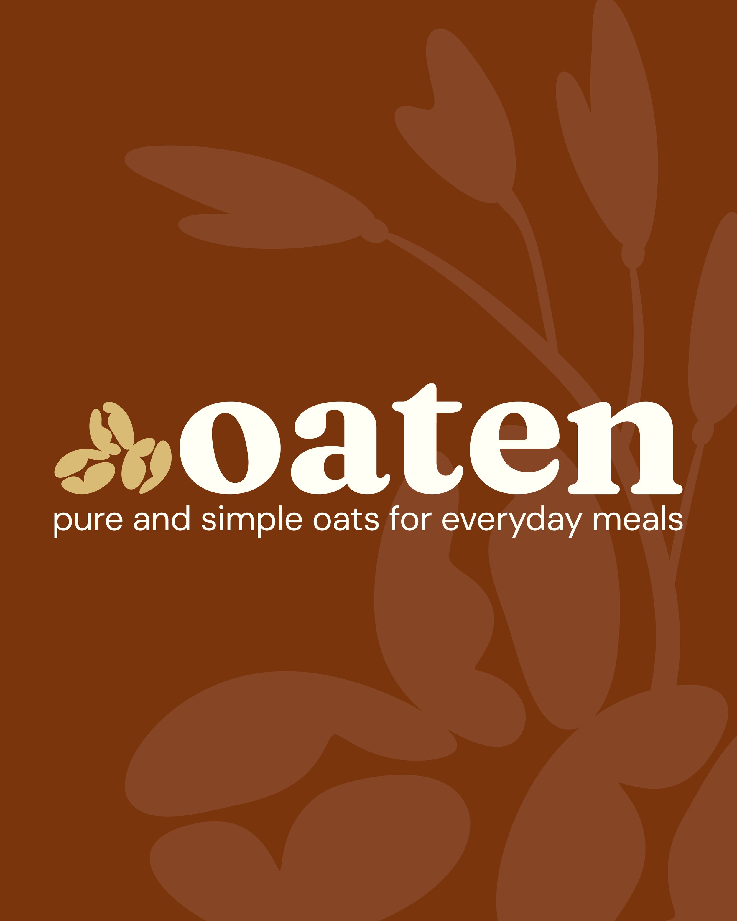
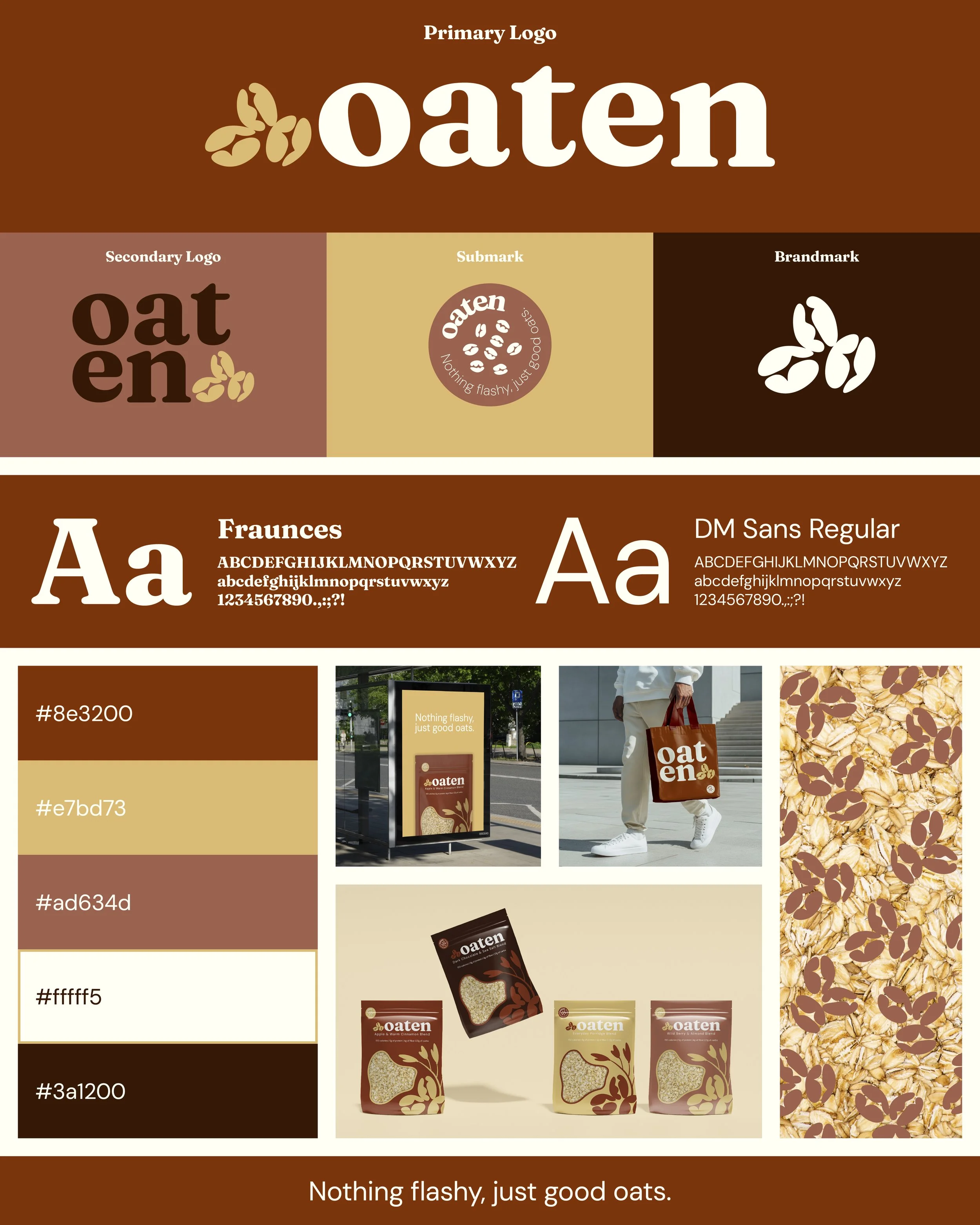
Oaten Branding & Packaging
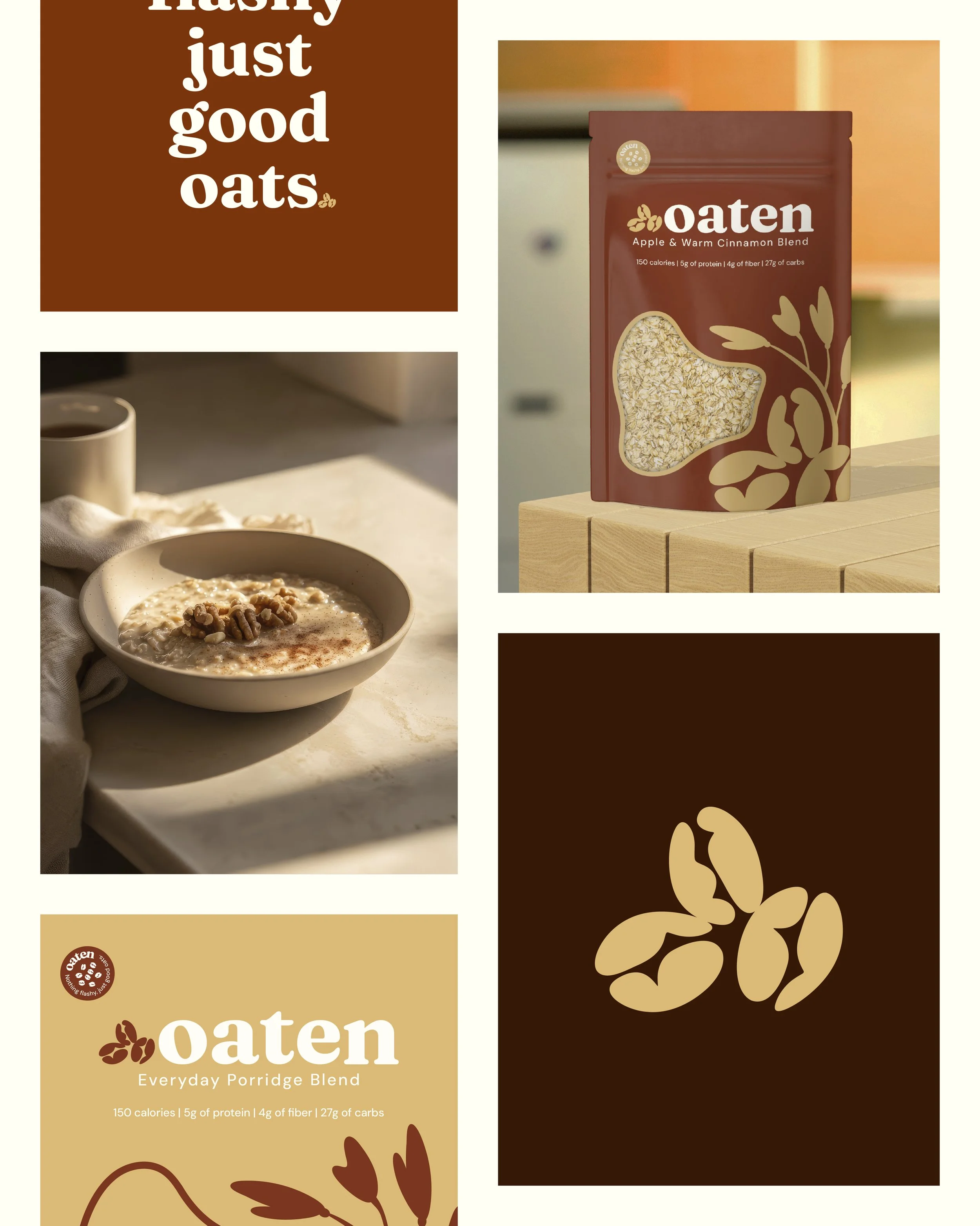
The Brief: The challenge was to create a visual identity and packaging system for Oaten which is a modern porridge brand focused on nutritious everyday breakfasts. The goal was to communicate honest ingredients and a calm start to the day while adhering strictly to the client directive of nothing flashy just good oats.
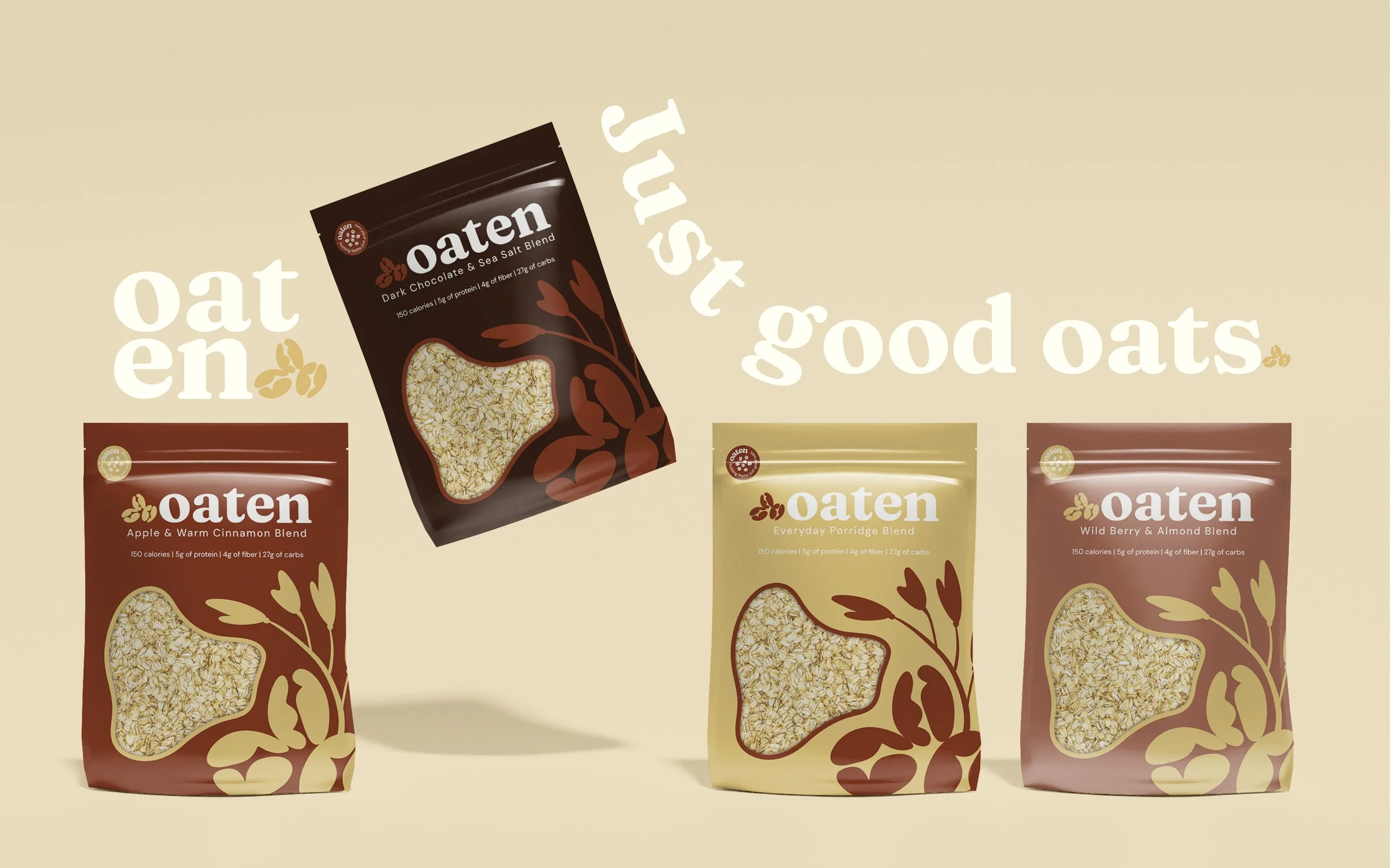
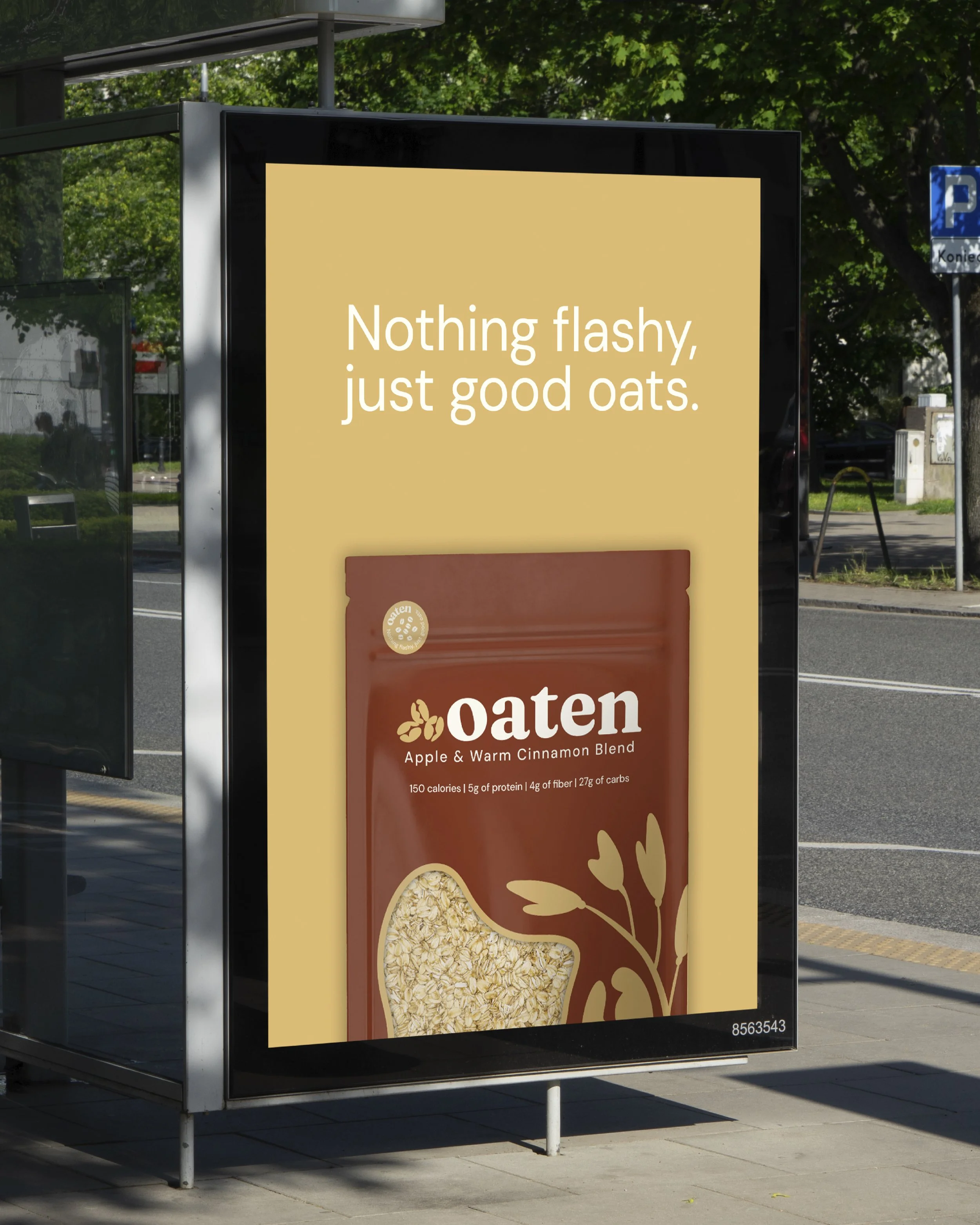
The Concept: The design philosophy embraces transparency and warmth by rejecting corporate gloss for a grounded slow morning aesthetic. By prioritizing negative space and organic forms the visual identity communicates trust and nourishment to position the product as a wholesome staple rather than a sugary treat.
The Execution: The final system pairs the warm heritage style Fraunces serif with the clean utility of DM Sans set against an earthy palette of terracotta and golden wheat. Matte stand up pouches feature custom oat stem illustrations and a distinct cut out window allowing the quality of the raw ingredients to serve as the hero of the design.