Oaten
Role: Brand & Packaging Designer
Deliverables: Visual Identity, Packaging System
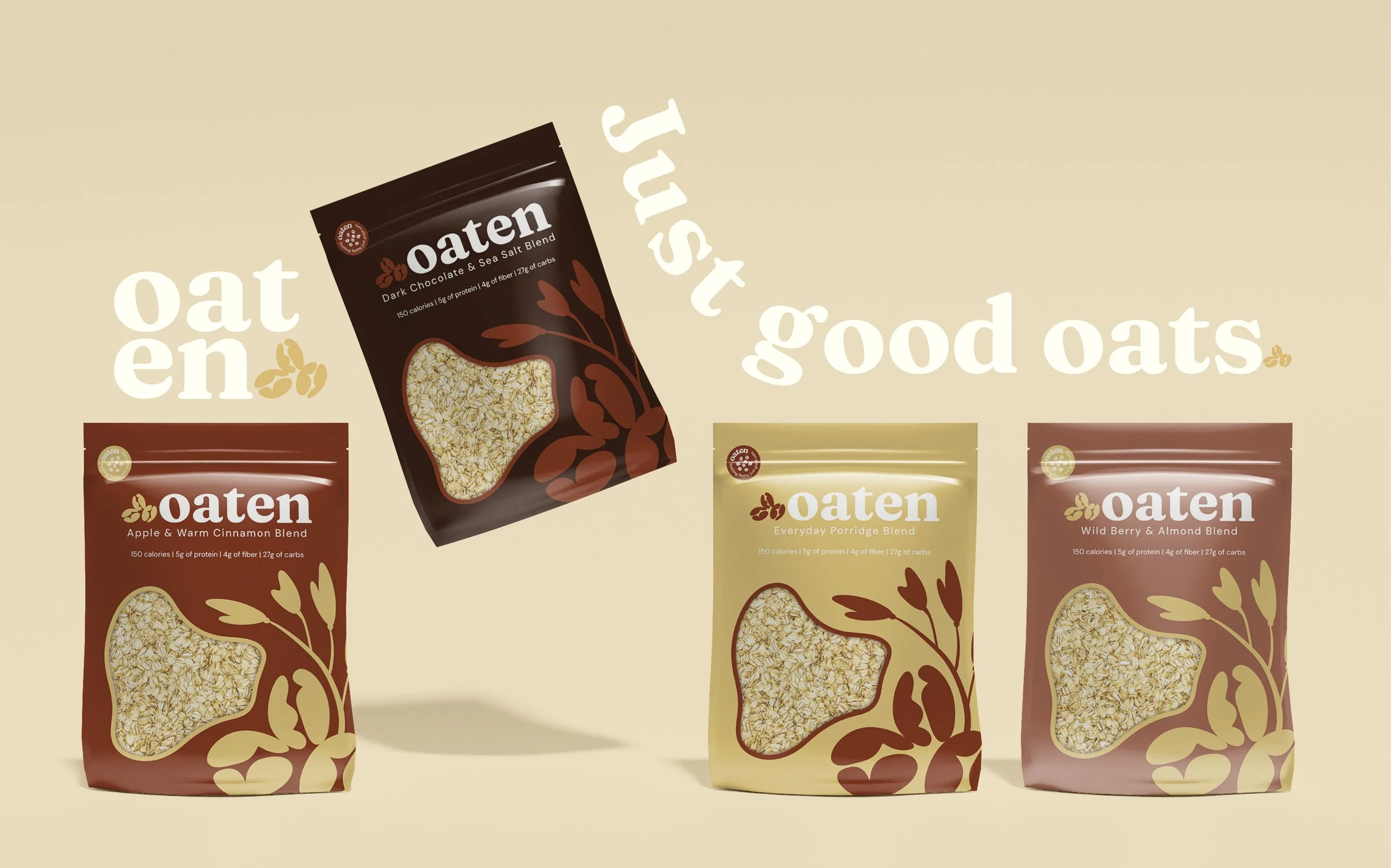
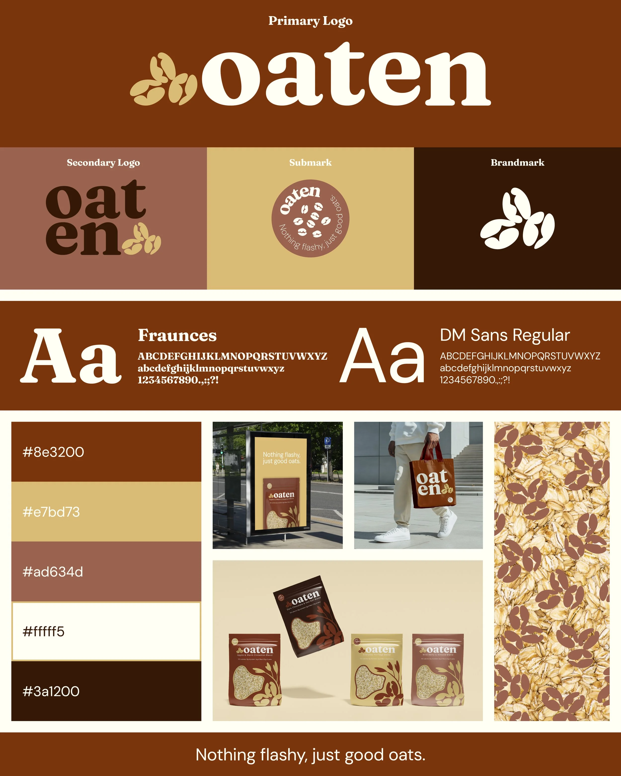
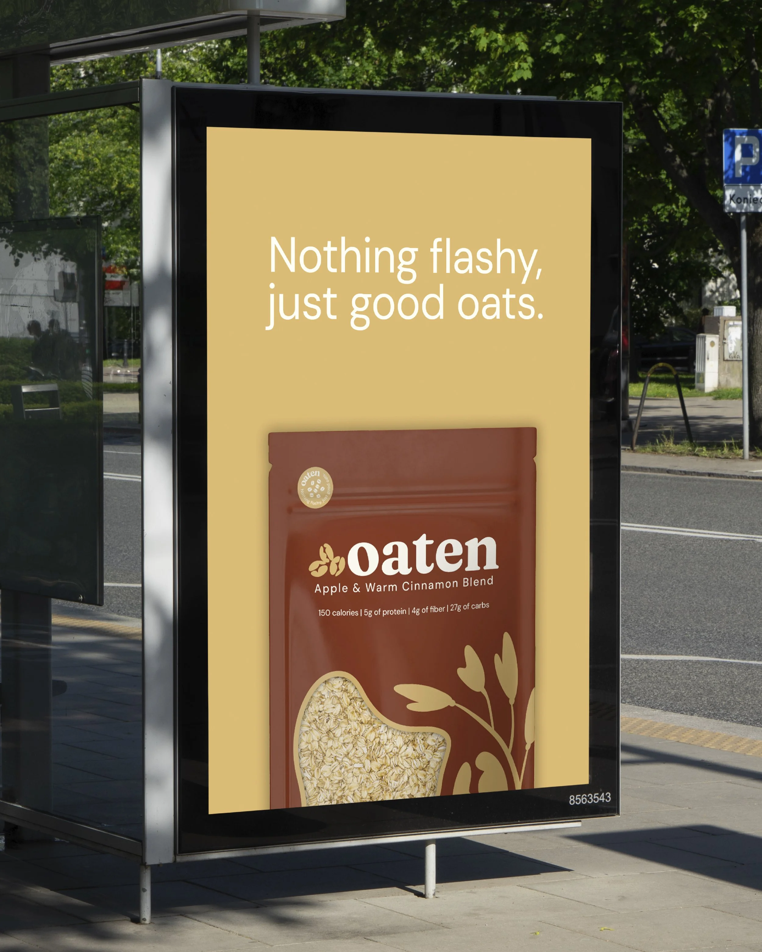
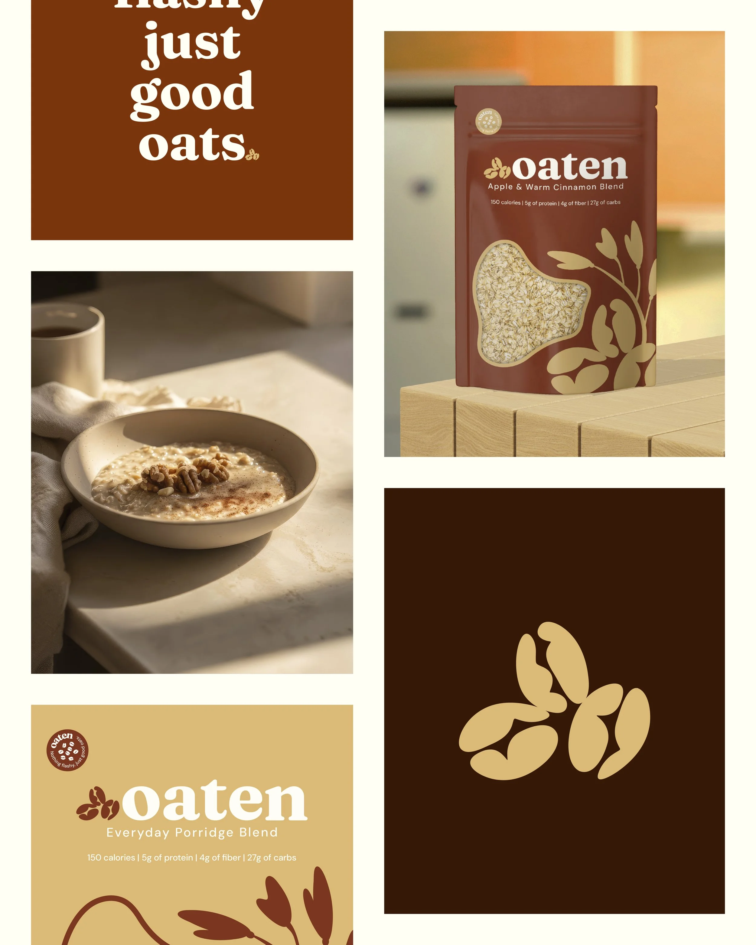
Guided by the client's simple vision of "nothing flashy, just good oats," I created a complete visual identity and packaging system to position Oaten as a contemporary everyday breakfast staple. The challenge was to communicate a grounded, slow morning aesthetic that felt both honest and modern without relying on overcomplicated graphics. To solve this I developed an earthy terracotta and wheat color palette complemented by a sophisticated mix of heritage serif and clean utilitarian typography. The outcome was a cohesive set of matte stand up pouches featuring custom oat illustrations, strategic use of negative space, and a distinct cut out window that allows the raw ingredients to take center stage.